
Project Overview
For this project, I wanted to be able to add a custom tooltip to a range of text in the rich text editor. The tooltip would need to have a unique text that the user could input, so that the format could be used multiple times throughout the page.
This was my first time adding a custom button to the rich text formatting toolbar. It is a lighter weight alternative to registering an entire new block, and offers an intuitive way for editors to add inline formatting.
I spent a lot of time exploring and learning for this project, and if this is your first time creating a custom formatting button, I would suggest you do the same! Start simple, then slowly add functionality. Make mistakes, and figure out why what you’re doing isn’t working. This is the best way to understand why something IS working when it does!
To-Dos
- Add a button to the format toolbar
- Create a pop-up for user input anchored to selected text range
- Pass dynamic tooltip text into CSS for use in a psuedoelement
Concepts Used
- registerFormatType() function
- RichTextToolbarButton component
- Popover component
- TextControl component
- useState() hook
- getBoundingClientRect() method
- Psuedoelements
- Data attributes
Docs & Resources
- Format API Documentation
- RichText Package README on GitHub (I HIGHLY recommend reading this to understand the Value object)
- Popover Component Reference
- Core Rich Text Italic Plugin index.js file on GitHub
Getting Started
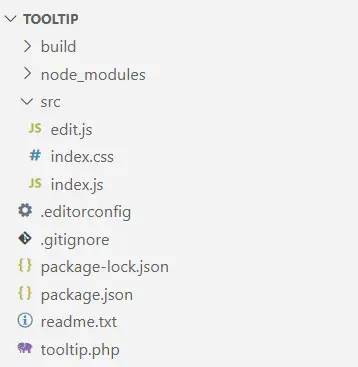
I started by running npx @wordpress/create-block@latest, even though it scaffolds much more than we need for just adding a format button. Then I went ahead and altered the files and structure to be only what I needed. In the src folder, I only kept the edit.js, index.css, and index.js files. We can clear out their boilerplate code since we will be registering a format button instead of a block.
Here is some more information about these files:
plugin.php
The boilerplate php file in the root directory that enqueues the plugin is initially set up for a full custom block. We aren’t registering a block, but just enqueuing our asset files.
index.js
This file is responsible for registering the format type. Similar to registering a block, it uses the function registerFormatType() and takes two arguments: ‘namespace/format-type’ and a configuration object.
edit.js
The edit file contains the exportable Edit() component. Unlike the block scaffolding, we will not use the { attributes, useAttributes } parameter. Instead, the Format API defines a parameter object with three variables for us to use: value, onChange, and isActive.
index.css
The edit file contains the exportable Edit() component. Unlike the block scaffolding, we will not use the { attributes, useAttributes } parameter. Instead, the Format API defines a parameter object with three variables for us to use: value, onChange, and isActive.
User Flow
Once we have our files set up and ready to go, it is helpful to imagine yourself as the user to conceptualize what using the button would be like. For this custom tooltip button, I wanted to have the following user flow and functionality:
- User highlights an existing portion of rich text to be used as a trigger text.
- Editor displays rich text formatting toolbar.
- User clicks the tooltip format button.
- Editor displays a popover with an input field and an apply button.
- User enters their tooltip text and clicks ‘Apply’.
- The tooltip text will now appear when the user hovers over the trigger text.
- If the user clicks anywhere within the applied formatting range, the popover will appear again with the current tooltip text already in the input field. The user can either alter the text and apply again or delete the tooltip formatting.
Core Logic
Now, let’s get more specific about how the functionality of that user flow will work.
Display a button in the rich text toolbar
To simply add a button to the toolbar, we return the RichTextToolbarButton component in our Edit function. In our index.js file, we use registerFormatType() instead of registering a block. registerFormatType() takes two arguments: the unique name of the format, and the configuration object.
Use the highlighted text as an anchor
Using window.getSelection() and getBoundingClientRect(), we can create an anchor to visually place the dialogue box directly beneath the highlighted text and the useState() hook to keep track of the state of the anchor for when the user selects a different range of rich text.
Display pop-up dialogue when clicked
We can use the useState() hook to store whether the Popover component is visible or not.
Store the user-input when the apply button is clicked
We can use the useState() hook to store the value of the TextControl component’s input field and set the state using the apply button onClick attribute.
Apply the user-input value to CSS psuedoelement
By altering the user-input to create a html-safe unique class and adding a data attribute containing the user-input, we can dynamically display the user-input content for each tooltip format in the post.
Complete Annotated Files
Below I have annotated some of the finished files for this plugin. In the src folder, we have edit.js, index,js, and index.css and in the root directory we have tooltip.php.
import { __ } from '@wordpress/i18n'; //The syntax that allows WordPress to translate text to other languages.
import { RichTextToolbarButton } from '@wordpress/block-editor'; //The button that will appear in the toolbar.
import { applyFormat, removeFormat } from '@wordpress/rich-text'; //Applies and removes our custom format.
import { Popover, TextControl } from '@wordpress/components'; //The components that will pop up for user input.
import { useState } from '@wordpress/element'; //React useState() hook for managing state.
import './index.css'; //Our css styling for our format and editor UI.

//Below is our Edit function declaration with the necessary parameter object.
export default function Edit({ isActive, onChange, value }) {
  const [ isVisible, setIsVisible ] = useState(false); //To manage our popover visibility.
  const [ tooltipText, setTooltipText ] = useState(''); //To manage the content of the tooltip text.
  const [ anchor, setAnchor ] = useState(null); //To manage where the popover will appear.
  const tooltipClass = tooltipText.replace(/[^a-zA-Z]/g, ''); //To create an HTML-safe unique class name.

//Below is our handler for applying the format to the selected text.
  const handleApply = () => {
    onChange(
      applyFormat( value, { //Applies the format specified to the selected range.
        type: 'tooltip/tooltip',
        attributes: {
          'data-tooltip': tooltipText, //Adds a custom HTML data attribute so we can use it in our CSS.
          className: tooltipClass
        }
      })
    );
    setIsVisible(false); //Once we click Apply, we want the popover to disappear.
  }

//Below is our handler for removing the format from the selected text.
  const handleRemove = () => {
    onChange(
      removeFormat( value, 'tooltip/tooltip') //Removes the format.
    );
    setTooltipText(''); //Resets the state to an empty string.
    setIsVisible(false); //Hides the popover.
  }

//Below is the handler function for when we click on the format button in the toolbar.
  const handleClick = () => {
    let selectedText = window.getSelection(); //Returns a selection object which includes info about the selection node and its offest within that node.
    if (selectedText.rangeCount > 0) { //Only executes if selection is not collapsed.
      const range = selectedText.getRangeAt(0); //Stores the entire range as a Range object in variable range.
      const rect = range.getBoundingClientRect(); //Returns the size and position of a rectangle.

      setAnchor({ //Our state updating function for our anchor state. We will pass in a VirtualElement object.
        getBoundingClientRect: () => rect, //Visual positioning.
        ownerDocument: document //Top level document of our node.
      }); //Read more about the VirtualElement object in the Popover Component documentation.

      //Since our formats are not kept via a save function and instead stored inline in the HTML,
      //each time we want to access our tooltipText, we will need to set a new tooltipText state.
      //We need to find the existing tooltip text in the selection's data-tooltip attribute,
      //then use our state updater function, setTooltipText, to get it to display in our input field for editability.
      if (isActive) { //If selection has an active format, find the tooltipText state and add to input field.
        const activeFormat = value.formats[value.end]?.find( //Find the format at the end of the selection.
          (format) => format.type === 'tooltip/tooltip' //If that format is our custom format, store in activeFormat.
        ); //Read about the Value object in the docs. See Resources at the beginning of this post.
        if (activeFormat) {
          setTooltipText(activeFormat.attributes['data-tooltip']); //Set the tooltipText to the existing data-* attribute.
        }
      }

      setIsVisible(true); //Displays the Popover.
    }
  }

	return (
    <>
      <RichTextToolbarButton //Gutenberg component for a rich text toolbar button.
        icon='info'
        title={__('Tooltip Text', 'tooltip')} //Translatable button title that will appear in the toolbar.
        onClick={handleClick} //Calls the handleClick function.
        isActive={ isActive } //Determines if the button is highlighted when a format is applied.
      />
      {isVisible && ( //Only displays if isVisible's state is true.
        <Popover //Gutenberg component similar to a modal.
          className='popover' //Added a class name for styling the popover.
          anchor={ anchor } //The popover will be anchored to the value stored in the anchor state.
        >
          <TextControl //Gutenberg text input field component.
            className='text-control' //Class for styling.
            label={__('Tooltip Text', 'tooltip')} //Translatable label for text input field.
            value={ tooltipText } //Value set to what is stored in the tooltipText state.
            onChange={(val) => setTooltipText(val)} //Callback function to update state as you type.
            help={__('Enter tooltip text here.', 'tooltip')} //Translatable help text.
            hideLabelFromVision //I wanted to display the help text, but not the label. Just a style choice.
          />
          <div className="pop-but-cont">
            <button onClick={handleApply}>Apply Tooltip</button>
            <button onClick={handleRemove}>Remove Tooltip</button>
          </div>
        </Popover>
      )}
    </>
	);
}import { registerFormatType } from '@wordpress/rich-text'; //Gutenberg function to register a format type.
import './index.css'; //Import our css styling.
import Edit from './edit'; //Import our Edit function.
registerFormatType( 'tooltip/tooltip', { //First argument registers the name of the plugin. Then our config object.
title: 'Tooltip Button',
tagName: 'span', //The type of tag that will wrap the selected rich text in order to apply the format.
className: 'trigger-text', //The styling for the format.
edit: Edit, //Provides instructions for how our button should behave.
} );
.trigger-text {
    position: relative; /*We want to position our tooltip relative to the trigger text.*/
    box-sizing: border-box;
    font-weight: bold;
  }

.trigger-text::before, .trigger-text::after { /*Pseudoelements for the tooltip text and the triangle.*/
    position: absolute; /*Take the tooltip out of the flow of the document.*/
    left: 50%; /*Position it 50% of the width of the parent away from the left bound of the parent.*/
    opacity: 0; /*Set initial opacity to 0.*/
    transition: opacity 300ms ease; /*Create a smooth transition into view.*/
    z-index: 10; /*Ensure tooltip is placed on top of the other elements.*/
}

.trigger-text::before {
    content: ""; /*Empty content for now, but will be dynamically filled in later.*/
    width: 200px; /*Must define a width so we can center it.*/
    background-color: var(--wp--preset--color--contrast); /*Use a wordpress-defined theme variable for color.*/
    color: var(--wp--preset--color--base); /*Same as above; this changes when you change theme colors.*/
    bottom: calc(100% + 10px); /*Position tooltip text 100% + 10px up from the bottom of the parent element.*/
    transform: translateX(-105px); /*Adjust the positioning to account for half of the width + left padding.*/
    text-align: center;
    padding: 5px;
    border-radius: 10px;
    pointer-events: none; /*Ensures the tooltip's opacity only gets set to 1 while hovering the trigger text.*/
    font-size: var(--wp--preset--font-size--small); /*Wordpress variable for font size.*/
    line-height: 1.25;
}

/*Below is a trick for creating a triangle pointer by using border widths, since each border creates a polygon.*/
/*You can google this - it is a pretty common trick.*/
.trigger-text::after {
    content: "";
    border: solid 6px;
    border-color: var(--wp--preset--color--contrast) transparent transparent transparent;
    transform: translateX(-3px);
    bottom: 100%;
    height: 0px;
    width: 0px;
}

.trigger-text:hover::before, .trigger-text:hover::after {
    opacity: 1; /*Display tooltip text and triangle on hover.*/
}

.text-control { /*Styling for TextControl input field.*/
    width: 200px;
    padding: 10px;
}

.pop-but-cont { /*Styling for buttons in Popover*/
    display: flex;
    padding: 5px;

}

/*Here, we dynamically set the tooltip text by using a data-* attribute.*/
/*We add this css property to a class we dynamically create in our edit.js file.*/
[data-tooltip]::before {
    content: attr(data-tooltip);
}<?php
/**
* Plugin Name: Tooltip Button
* Description: Adds an inline tooltip.
* Version: 1.0
* Author: Katie Pardee
* Text Domain: tooltip
*/
function tooltip_enqueue_assets() {
wp_enqueue_script( //Specifies the javascript files to enqueue.
'tooltip-editor-scripts', //Unique name for this asset.
plugins_url('build/index.js', __FILE__), //Location of the file relative to plugin.
[ 'wp-rich-text', 'wp-block-editor', 'wp-element', 'wp-i18n' ] //Dependancy array.
);
wp_enqueue_style( //Specifies the CSS files to enqueue.
'tooltip-editor-styles', //Unique name for this asset.
plugins_url('build/index.css', __FILE__) //Location relative to plugin.
);
}
//Tells wordpress to run our enqueuing functions for our plugin when it runs the enqueuing function for the rest of the blocks.
add_action('enqueue_block_assets', 'tooltip_enqueue_assets');